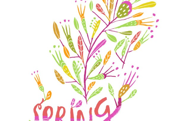
Experiments: Building up with light and color

The other day I posted in the Kidlit Artists Blog about building up with light and color.
I thought I’d share the post here as well, hope you enjoy! You can also see the original post here
Many artists start creating their pieces building up from light to dark. It can be a great way to gain depth and go step by step into the details, but in this post I want to talk about the opposite practice: building up with light and color. 
In some ways this method can be similar to a few printmaking techniques, where the artist creates the white areas from within a black canvas.
Playing with acrylics and positive/negative
One of my favorite children’s book artists is the Italian Simona Mulazzani, illustrator of picture books such as “I wish I had…” and “The Big Book of Slumber”.
She starts with a black background; slowly blocking shapes from black to light. Thanks to this black contrast her compositions are also full of vivid rich colors which enhance the beautiful fantasy in her images.
  
Page from Mulazzani’s article “The Creation of an Illustrated Book” in “Le Immagini della Fantasia” Catalogue 2008, Sarmede, Italy
 
There are many other fun ways of creating pieces with lighter tones, such as using darker tones on top of an already dry surface with bright and colorful tones and drawing its surface with a dry (and often pointy) object while it’s still wet. 
If you’re using a surface harder than paper (such as wood) you can always use a knife for that.
 
 
Details from some paintings for the show “Animaginary Landscapes” at Tr!ckster Gallery, Berkeley, 2015
Playing with scratchboards and positive/negative
One of my favorite techniques for playing with the brighter tones is to create your own scratchboard. This process emulates printmaking without having to use a press.
Some amazing illustrators that use scratchboards are Remi Saillard (who taught me the beauty and fun of scratchboards), Beth KrommesThomas Ott,  and evenShaun Tan in “Tales from Outer Suburbia”
 
 
Illustration from “O Corbeau” by Marcus Malte, illustrated by Remi Saillard, Syros 2010
Illustration by Remi Saillard
Illustration from “Cinema Panopticum” by Thomas Ott, Edition Moderne, 2005
“The House in the Night” by Susan Marie Swanson illustrated by Beth Krommes (2009 Randolph Caldecott Medal), Houghton Mifflin, 2008
Illustration from “Tales from Outer Suburbia” by Shaun Tan, Arthur A.Levine Books, 2009
Scratchboards can be bought, although I would recommend making them by hand. That way you can play and experiment with different colors and ideas.
Not too long ago I experimented with the following process:
1. I projected the final sketches in illustration boards
2. Then I painted with very liquid acrylic paints, creating liquid textures using colors of choice
3. I filled all the surface with oil pastels or crayons of the according color
4. After that I covered the greasy surface with Indian ink or airbrush ink
5. and once it was wet, I scratched it off with a good knife (Olfa is the best, it feels like butter).


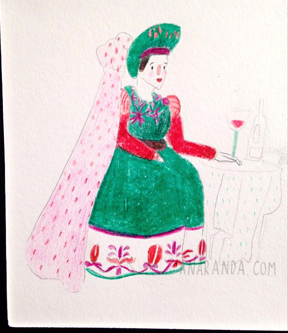
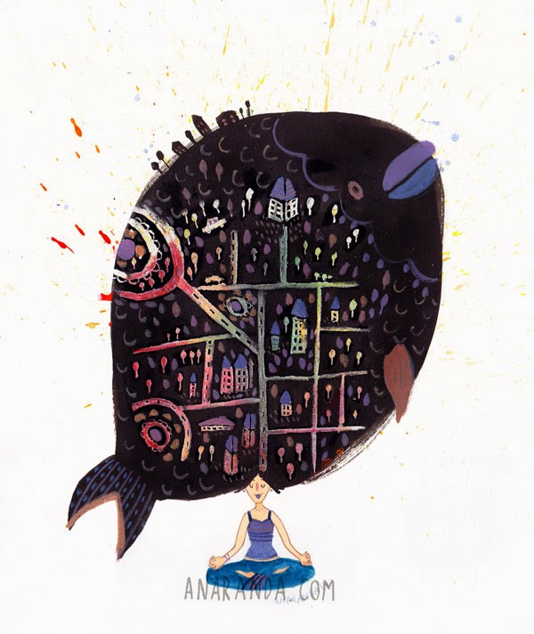
Illustrations and process for the pieces in “Case” written by Chiara Di Palma, Il Gioco Di Leggere Edizioni, 2012

 
You can also check out Beth Krommes’ process for scratchboard hereLately I’ve been experimenting with watercolors and inks in the scratchboards. It’s lots of fun! My process is very similar to what I previously described, but it feels more spontaneous:
1. First use a cold press board/cold press stretched paper, draw the general lines of the piece
2. Then go crazy creating washes with watercolor and inks (Dr. Ph. Martin’s, Winsor and Newton, Ecoline)
3. Cover all the part you want to scratch with a white crayon (I like using the Caran d’Ache crayon, but any greasy crayon will do)

4. Paint the dark shapes with Indian ink or airbrush ink, playing with positive and negative.
5. Scratch the parts where you want to have some details, patterns, etc.
When you’re not planning exactly which color will be, some unexpected and fun surprises come in the way!
 
 
Illustration for Mandalah Mexico


To me is more natural to create dark shapes and build up with light, since I love to have bright and vivid colors in my illustrations. What do you enjoy the most? Dark on light or light on dark? How do you have fun with light and color?
I hope this little post gives you some ideas on how to create, play and overall, to have fun!
Thanks for stopping by!

Animaginary Landscapes Artist Reception

Thank you so much to everyone who came to the show “Animaginary Landscapes” at Tr!ckster Gallery! It was a fantastic night!
Thanks so much to Tr!ckster and the awesome Anita for everything!

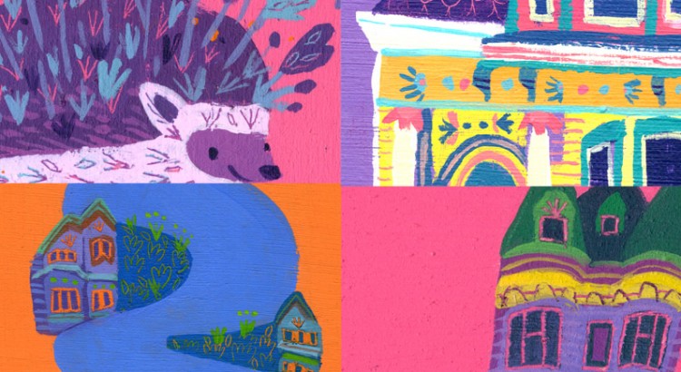
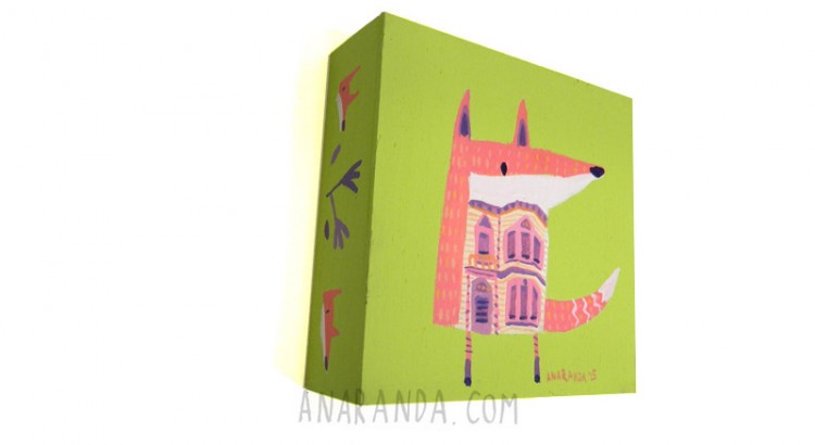
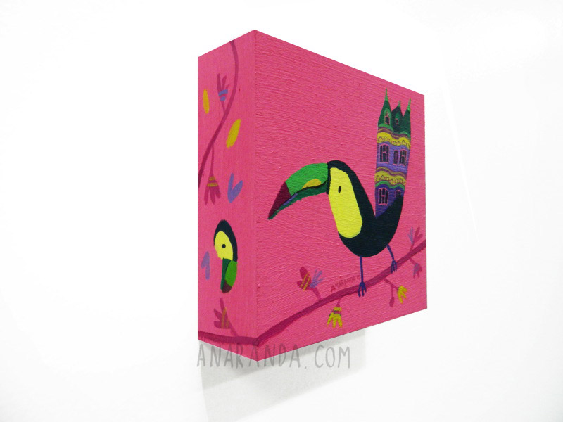
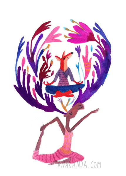
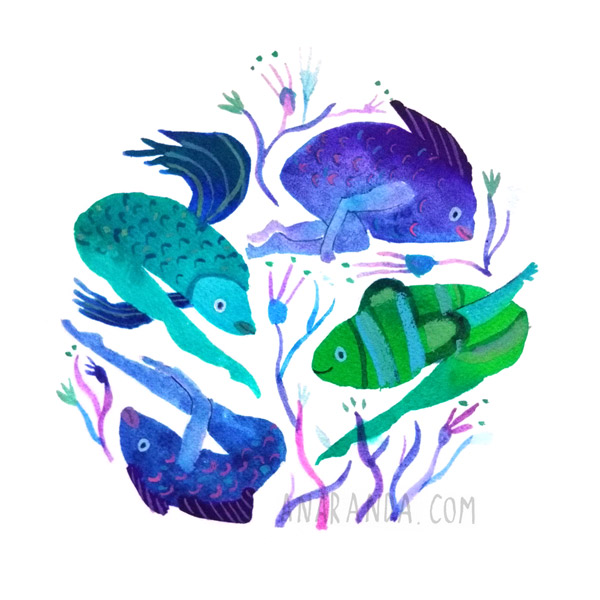
Most of the pieces for the show were created with pigment and acrylic on woods.
The pigments have been collected from all over the world. Each pigment was hand mixed specifically for this show.

Here are some of the pieces from the show:

gallery_fox

gallery_whale

gallery_zebra

gallery_elephant  gallery_hedgehog  gallery_peacock gallery_pupperfish gallery_sloth gallery_toucan

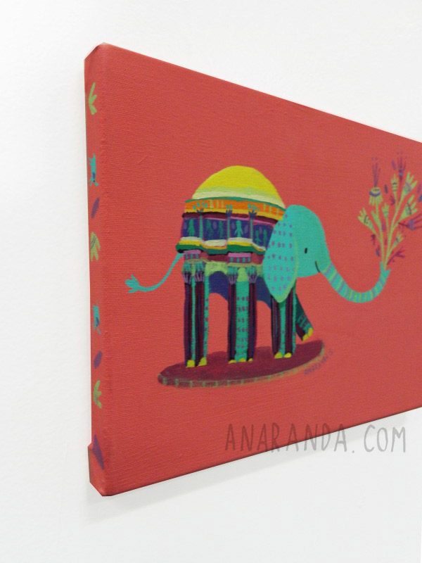
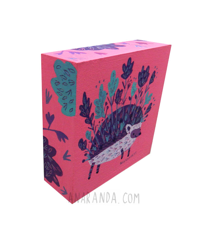
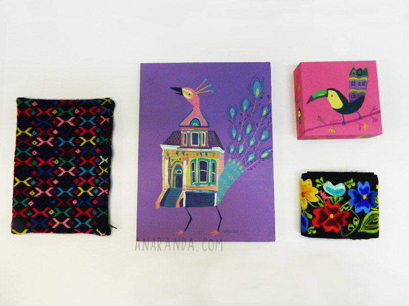
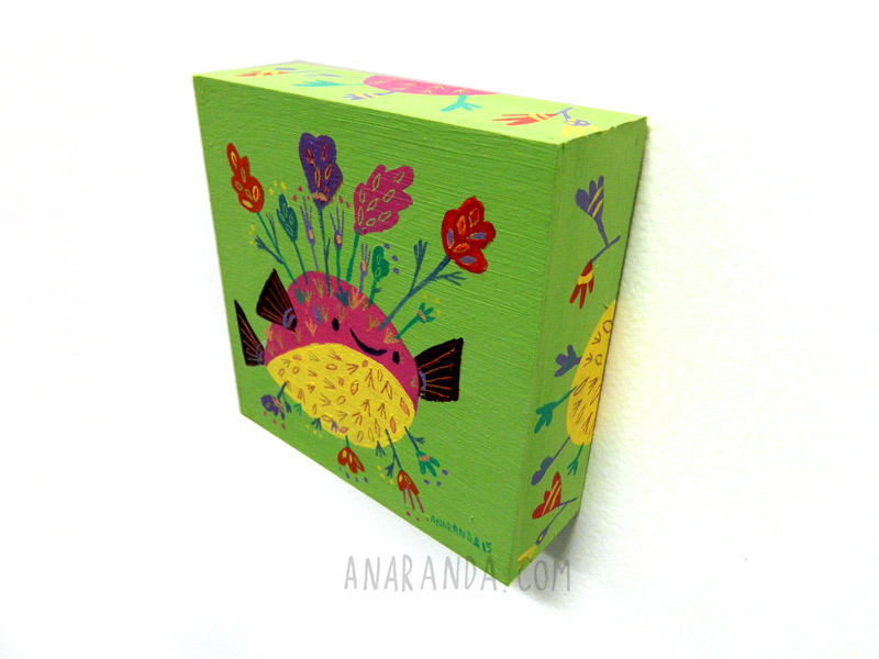
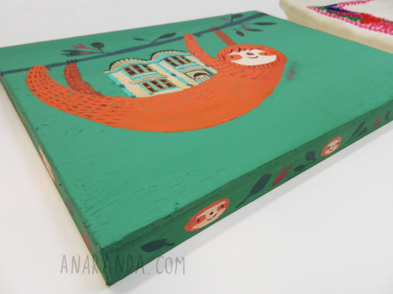
Photo credit: Diana Garcia

If you want to purchase some of the original artwork, you can get it either at Tr!ckster or in their online shop

The show is still up so feel free to stop by and check it out!

2631 Ashby Ave, suite A, Berkeley, CA 94705
Phone: 510-665-8900
Store Hours: Tuesday–Sunday 11:00am–7:00pm, Closed Mondays

Thanks for stopping by!

Solo show “Animaginary Landscapes” at Tr!ckster, Berkeley !

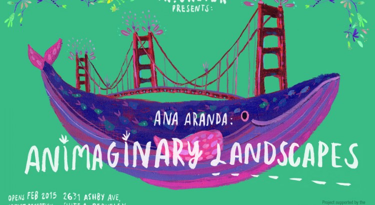
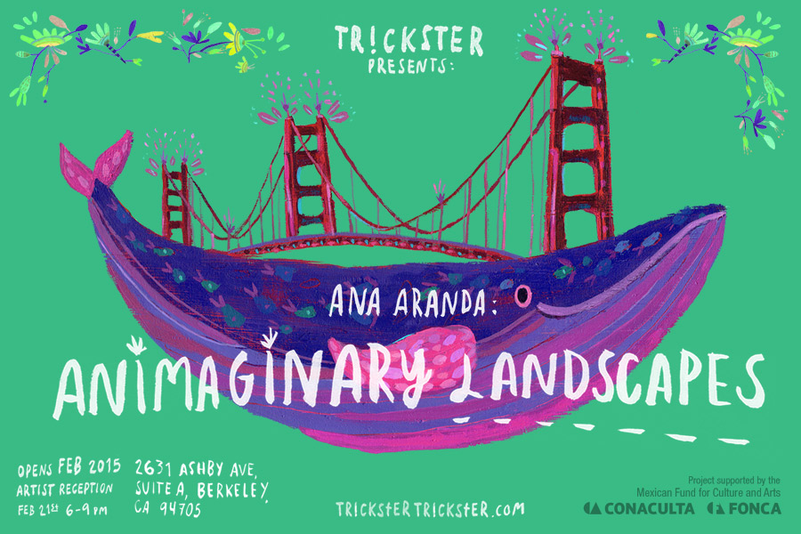
I would love to invite you all to my very first solo show in the U.S.  “Animaginary Landscapes” this February 21st at  TR!CKSTER in Berkeley.
I will be showing some fun paintings and will be very happy to see you there!


Animaginary-Landsc-Postcard


Here are the event details for the opening:

Artist Reception – February 21st 6:00 – 9:00 pm
Tr!ckster – 2631 Ashby Ave, Suite A, Berkeley, CA 94705

Thanks for stopping by!

“Art of the Costume” Show – Italian Cultural Institute

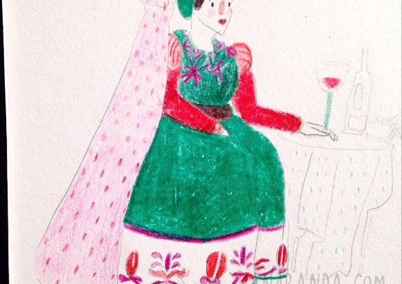
I am very happy to find out today that I have some pieces at the show “Art of the Costume” at the Italian Cultural Institute, with some really amazing artists, come check it out!
The show will be up until January 9.

The show includes beautiful art from some amazing artists such as Lisa BerretWilliam MaughanGeorge Cwirko-Godycki, Thomas GronbuktSarah Barrie Fenton, Loy Bouttamy and Farid Hussein
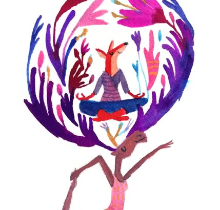
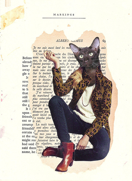
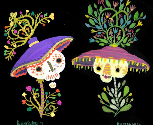
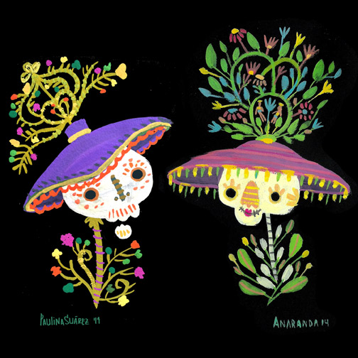
 

Art-f-costume_Anaranda

FORM Design Conference – Science Fiction & Design

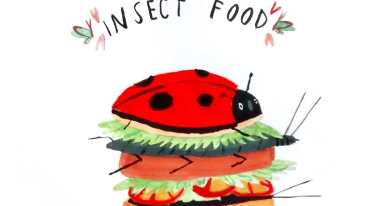
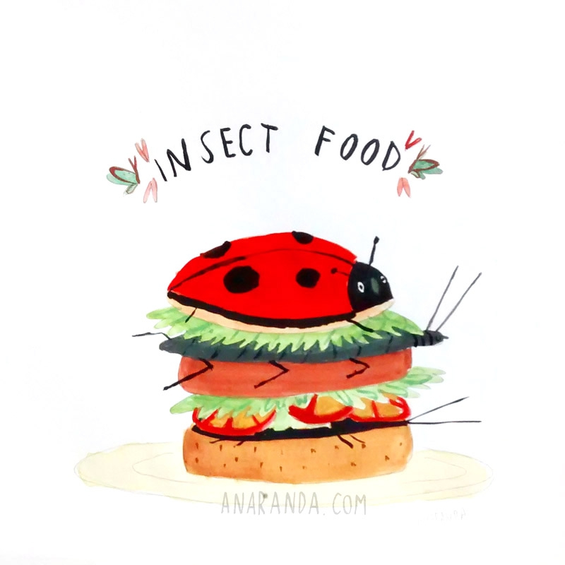
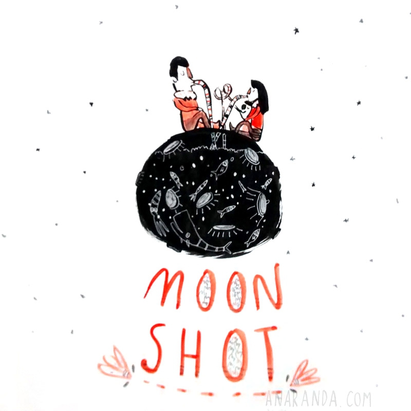
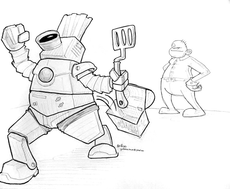
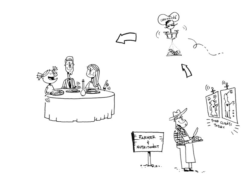
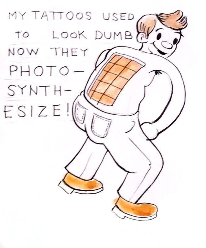
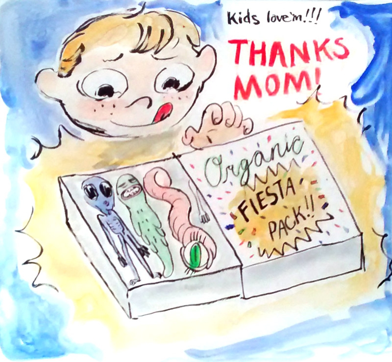
This past Tuesday a I was invited to draw with the amazing artists Katy Wu, Ryan Germick, Hector GHF and Gus Reyes in the FORM Conference in San Francisco.
We had a 30 min challenge to draw the future of food during the workshop “Science Fiction & Design” lead by the inspiring Nadya Direkova and Mac Smith from Google[x]

Thank you so much Nadya and Mac for this awesome experience and the designers who participated in the workshop for the inspiration!
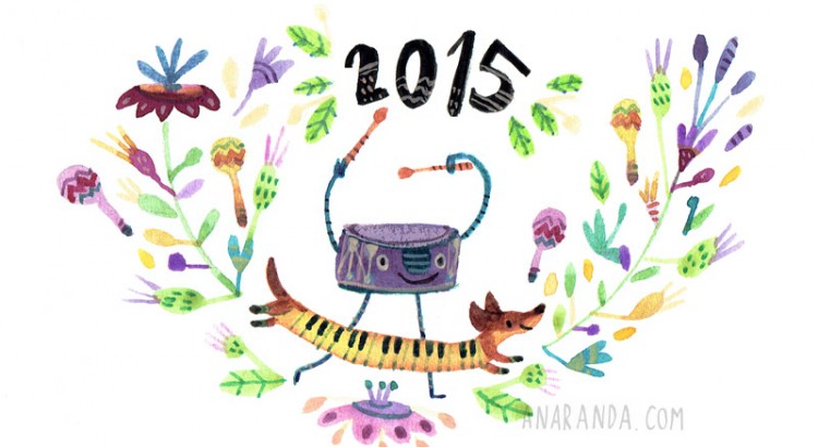
Here are some of the images of what was predicted for 2015, 2020 and 2030


By the amazing storyboard artist and poet Gus Reyes

By the amazing multimedia artist Hector GHF


By the amazing Doodler Ryan Germick


By the amazing Doodler Katy Wu


Thanks for stopping by!